Better Bean company
imagina updated packaging graphics for Better Bean Company's new containers that use inmold labeling.
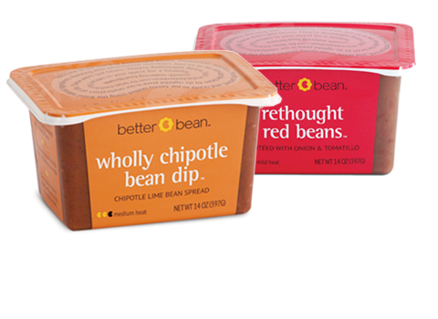
To help Better Bean stand out on the shelf, imagina applied brilliant color to the tub's panels and lid. The bright front panel is, unclulttered and easy to read. Visual elements, selected from the full side-panel illustration, were placed on the lid and opposite side to tie everything together.
You can also see the full product line, view Better Bean company identity and collateral, and read the July 2012 Packaging Digest feature article.
deliverables: package design, color palette; corporate identity, collateral, product sheets, t-shirts, tradeshow banners, coupons, labels
< >